Spring Colour Therapy: Rebel Yellow in the Interior
Psychologists, marketing specialists, who are able to catch and keep our attention even today, as well as manufacturers of objects that we surround ourselves with on a daily basis, are well aware of the fact that colour influences your emotions. While furnishing our apartment, we should learn from them and find out the secrets of colour therapy, so that the interior, which we will create, is not only nice or functional, but also has a positive impact on our wellbeing. After all, our home is our safe haven.

Most of us have their favourite colour and it is not necessarily the one that suits us. Most often, it is a colour that evokes pleasant associations and makes us feel good when we look at it. This is because colours have incredible power! Apart from refreshing memories and stimulating the subconscious, every colour (including white) has its own features, even if our brain does not associate it as a ‘favourite one’.
The history of chromotherapy, as colour treatment is referred to by professionals, dates back to antiquity, when Egyptians discovered that the colour seen by a sick person has an impact on the treatment of ailments. Many years had to pass before scientists resumed research on the issue and wrote down the secrets of all the colours in scientific, non-esoteric publications. Thanks to the knowledge gathered over the years, today we know what colour shades to choose in order to achieve a certain effect. Fatigue, discomfort, irritation – there is no state of mind that colour cannot cope with.
Colour properties

White has a positive effect on our mood, reflects negative energy and stimulates the immune system.

Black calms and spreads a mysterious aura, while green, just like vegetation of this colour, relaxes, gives hope and strengthens our empathy. Violet, a mystical colour, perfect for meditation and excursions deep into oneself, alleviates the symptoms of insomnia, just like blue, which has a cooling effect, stimulating the metabolism.

Going further along the rainbow, we come across warm shades stemming from hot red. The latter increases blood pressure and warms up the atmosphere, which is why it is responsible for the level of passion and ambition. Pink reduces negative emotions and infects us with optimism. Despite the lack of vitamin C in it, orange supports digestion and alleviates the symptoms of respiratory tract diseases, but primarily adds energy and mobilizes us to act.

Yellow is a special colour; the colour of the Sun, which almost immediately evokes positive associations and an impression of warmth in all those who look at it or think about it. In addition, yellow is one of the most fashionable colours, especially the shade called ‘rebel yellow’ or ‘mustard yellow’.
Why yellow will be a good choice for your home?

Firstly, yellow evokes joy and optimism. For this reason, it will be the best choice for a kid’s room.
Secondly, yellow brightens up thoughts, stimulates the brain and increases memory capacity, so it’s perfect for the interior designed for work and study.
Thirdly, yellow fights fatigue, relieves stress and has a positive effect on your mood, which is why it should be used in the bedroom.
Fourthly, yellow gives you a sense of security, warmth and comfort, so it will work well in a room where you spend your free time, relax and rest, i.e. in the living room.
Well-composed
Contrary to appearances, yellow goes well with many colour combinations. It looks great in combination with all shades of green – from bright lime to noble emerald. It creates distinct contrasts with white and black, which, depending on the proportions of the colours used, will create a minimalist (predominance of white) or maximalist composition (predominance of black). Mustard yellow also goes together with pastel pink and blue, and deep, heavy navy blue.
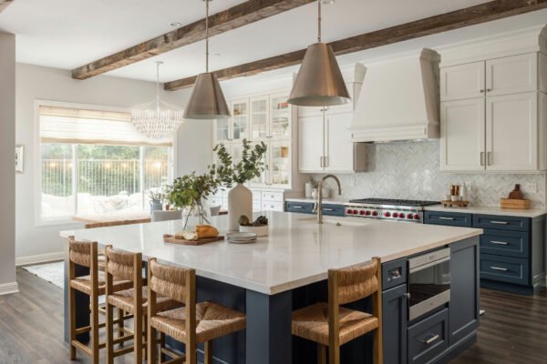
yellow + grey: sophisticated elegance and inventive arrangement

yellow + white + black: the power of contrast and the way to create an original design

yellow + powder pink: subtle accents and a pleasant climate in the interior

yellow + light green: the sense of spring freshness and lightness in the interior


