How to Design a Brochure that Stands out for the Right Reasons

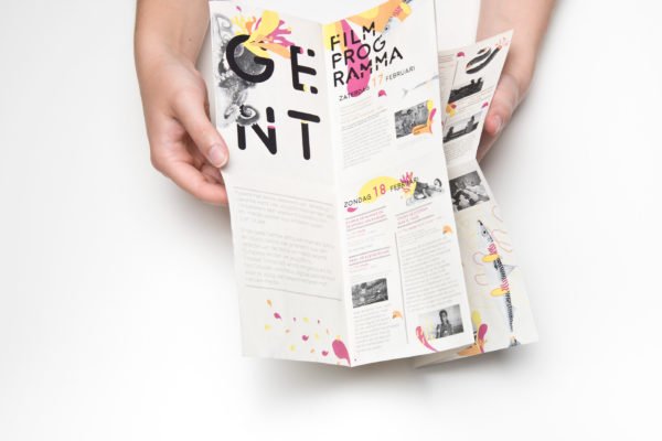
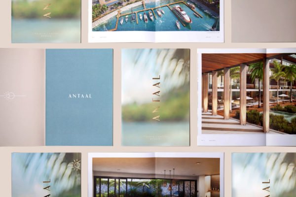
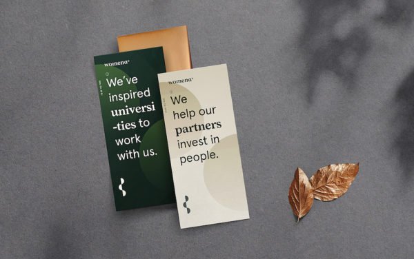
If your business flaunts a brochure that advertises your products, services and/or company values, it’s crucial that you design it in a way that allows it to stand out – for the right reasons. We’re exploring the elements that you should adopt in order to help this happen.
Include a call to action.
It’s absolutely vital that your brochure has a clear call to action so that your chosen audience knows what you are wanting from them. Give them the motivation to find out more about your products or services, and utilising this through the design is a great way to make this happen.
In a colourful box that stands out from the rest of the page, advertise a free sample, gift or discount if people call your telephone number of fill out an enquiry form on your website. Everyone loves to feel as though they’re special. As a result of doing this, your audience will be more likely to keep you in mind when they need your products or services.

Use clear, striking images.
The use of images within a brochure is just as important as the use of text – sometimes, even more important!
A striking, clear image will capture your audience’s attention first, motivating them to continue reading about what you have to say.

The image you pick should speak for your business and the products and services that are on offer. Not only will this deliver your message promptly, but it’ll also allow your brochure to stand out for the right reasons. Choose the best brochure images for your business and products by ensuring that they’re high in quality while matching the overall tone and design of the document.
Use captivating headlines.
A headline is the first opportunity you have to communicate with your audience and secure their attention. If you want to get immediate awareness, a bold and alluring headline is paramount. The headline should be short, snappy and informative, and the design of the headline should incorporate a certain type of font and colour to draw your readers’ eyes to the page.
Determine your audience.
What’s the point in designing a brochure if you’re not entirely sure who it’s supposed to target? In order to design a document that truly stands out, first you must find out who the target audience is. Explore who will buy your services or products, what they like and what their age bracket is. Focus on the right range of people and customise the style to fit their interests and requirements.
Keep your content short, but sweet.

Make sure your content is short but sweet, and placed somewhere within your brochure that will automatically steal attention. Chances are, your audience won’t give much time to your brochure, so get to the point quickly and efficiently.
Use feature-rich bullet points, take advantage of short paragraphs and be sure to include powerful headings. The aim is to allow your customer to understand what you are offering with the least amount of words and in the shortest amount of time.
Don’t underestimate the power of print…
Now you’ve designed your brochure using the points we’ve outlined above, what do you do next…?
Keep in mind that the printing process is just as (if not more) important as the design process. Booklet makers like Duplo International offers a paper printing service to more than 60 countries and have up to 100 local distributors.
The power of print communication is by no means ‘dead’, and you need a printing company that will help your brochure to truly stand out.


