


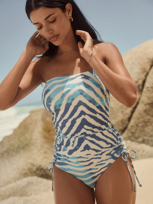


Forget Office Siren – Here’s How to Dress for Work

The internet is obsessed with the office siren aesthetic, with TikTok searches for “office siren work outfit” reaching over 2.5 million in the past week. But many critics argue the Gen Z workwear trend is inappropriate, with one TikTok discussing a woman being fired for dressing in the office siren style receiving 14.5 million views over the weekend.
So, if the office siren look is a little too risqué for the office, how can women still look stylish and feel confident in the workplace? According to Michael Kors and colour analyst Charlotte Elizabeth, wearing bold colours to the office can boost confidence and help shape the way others perceive you.
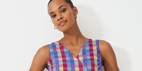
Enter ‘dopamine dressing’– the growing trend that received 3,000 Google searches last month alone. Dopamine dressing uses the belief that what you wear can positively influence your state of mind and potentially even those around you.
Charlotte explains: “Colour has the power to completely transform your mood, shift your energy, and even influence how others perceive you. Understanding the effects of colour psychology allows you to be intentional with the colours you wear, helping you align your wardrobe with how you want to feel and how you want to be perceived.”

83% of people want to wear more bold colours while just 17% want to wear more neutrals
While data says that many want to wear more bold colours, close to one in four (24%) prefer to dress in muted or neutral tones. Barriers to wearing more colour include personal fashion sense (51%), event appropriateness (42%) and weather conditions (38%).

However, with what we wear impacting our mood for 58% of us, it could be time to incorporate more colour this Spring.
How to ensure you’re channelling the right mood
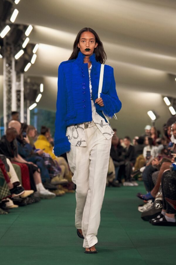
The top five colours people want to wear more of are red (18%), pink (15%), green (15%), blue (14%), and purple (10%).
Colour analyst and stylist Charlotte, explains how each colour affects our mood and influences those around us.
Red is the colour of confidence
Charlotte says “Red is the colour of power, passion, and action– it radiates power and confidence. It’s often associated with leadership, passion, and action – perfect for moments when you want to feel unstoppable. It increases heart rate and grabs attention making it a go-to for commanding presence and making a bold statement.”

Pink is softer and evokes compassion
“Pink has a softer, more nurturing effect, but depending on the shade, it can be playful (hot pink), romantic (rose), or calming (pastel pink). It’s linked to compassion and self-expression. It can evoke feelings of warmth, approachability, and even self-care. It’s often associated with compassion, making it a great choice when you want to foster connection and kindness.”

Green has a calming, grounding effect
“If you’re looking to project calm authority/ balance, green is your best ally. It’s a colour deeply connected to nature, harmony, and stability, making it ideal for situations where negotiation, diplomacy, or a sense of grounded confidence is needed.”
Orange is associated with warmth
“Orange is energetic, sociable, and fun. It’s associated with warmth, enthusiasm, and creativity, making it a fantastic choice when you want to feel dynamic and approachable.”
Neutrals provide stability and sophistication
“Neutral tones (such as beige, grey, navy, taupe, and white) provide a sense of stability, balance, and sophistication. They are often seen as professional, timeless, and understated.”
Picking colours that make you feel (and look) good
Dopamine dressing can make you feel good, but you also want to look good too. Investing in an in-person colour analysis session can help you gain a greater understanding of your own personal colour palette.
Charlotte said “Your true confidence colours are unique to you. A trained professional will analyse your skin tone and take into consideration other features, such as your eye and natural hair colour, to determine whether you have a warm or cool undertone and what depth of colours works best for you.”
“From here, you’ll fall into one of four seasons – Spring, Summer, Autumn, or Winter – each of which provides a set of colours that complement your skin tone. Not everyone can pull off bold colours; if you’re better suited to Summer or Autumn, you’ll look your best in softer, more muted tones. Whereas Springs and Winters can pull off brighter colours, as they won’t overpower their natural complexion. By understanding your season, you can confidently choose bold colours (or not!) that flatter your natural tones instead of working against them. The right bold colour won’t just stand out – it will make you stand out, in the best way possible!”
Where to start with incorporating colour
Block colours can feel intimidating for those who are used to dressing in more muted tones. If neutrals are more your thing, you could start small by incorporating a brighter colour through accessories – think a bold handbag, statement necklace or scarf.
Charlotte advises mixing both colours and neutrals if too much colour feels overwhelming.
“While bold colours inject energy and confidence, neutrals create a sense of calm and reliability. The best choice depends on the message you want to send and how you want to feel but sometimes, a mix of both is the key to a well-balanced look.”