From Pepsi to Royal Mail – Corporate Rebranding That Failed

It may often seem like a great idea to rebrand a company even if it’s a huge corporation, but even the best branding agencies and strategists can make a mistake. Rebranding is the perfect opportunity to rejuvenate an entire company and generate a positive hype amongst audiences (and press!). However, there have been many cases in the past where this has had quite the opposite effect. Not only does it look foolish to your audience if the new look isn’t ideal, but the financial repercussions could be massive also. Let’s take a look at a range of companies whose rebranding went drastically wrong.
British Petroleum (BP)
In 2000, BP replaced their timeless logo of 70 years and attempted to position themselves as an environmentally aware company. The logo was replaced with “Helios”, which is the Greek Sun God. Although this idea sounds good on paper, the results suggested otherwise. The only element that continued from old logo to new logo was the colour palette. The old logo used to be concise and had a small footprint. However, due to the typography being peripheral to the image on the new logo, the footprint has increased and the logo isn’t as practical. It’s greener than its predecessor, which has been included to highlight BP’s ‘Green Growth’ strategy. However, drilling into the ground for oil is far from being environmentally friendly. Also, this was deemed as tasteless by audiences due to the catastrophe of the Deepwater Horizon. Due to the anger caused, a competition was sparked to create the new BP logo.
Helios ended up costing BP £211,000,000. Just let that sink in.
Cardiff City
In 2012, Vincent Tan took over Cardiff City Football Club, who were infamously nicknamed The Bluebirds. The fans, players and staff all enjoyed their all blue home kit and all blue crest. However, Vincent Tan opted to change both kit and badge from blue to red. Understandably so, this alienated their supporters, caused controversy and many fans refused to carry on supporting their club. The whole club was seen as a shambles by many, due to the fact that the team played in a red kit whilst still being called The Bluebirds. And to dig the hole even deeper, Vincent Tan added a blue bird onto the red logo, which already contained a red dragon. All seems a bit chaotic, doesn’t it?
The rebranding of Cardiff City F.C. cost the club a whopping £100,000,000. However, they also lost a respectable proportion of their fans and therefore lost more revenue.
Pepsi
Pepsi is a brand that, despite being known worldwide, has to constantly work hard on their branding due to being in Coca-Cola’s shadow. As a result of this, Pepsi released their latest iteration of their logo. In this new logo, the circle is rotated and the white line through the middle enlarges to the right, supposedly representing a “cheeky smile”. Supposedly being the key word. Forbes Magazine even said that they can’t see the smile themselves. The feeling is mutual amongst many. As well as the smile not being recognisable, the white line through the middle varies in width amongst their products, lacking continuity. This portrayed Pepsi in a negative, unprofessional light. The whole rebrand was a bit of a farce as, the above issues aside, the logo had barely changed and the time and money consumption weren’t worthwhile.
The rebranding cost Pepsi Co £1,200,000,000 over 3 years. Yes, that’s right, over a billion pounds!
Royal Mail
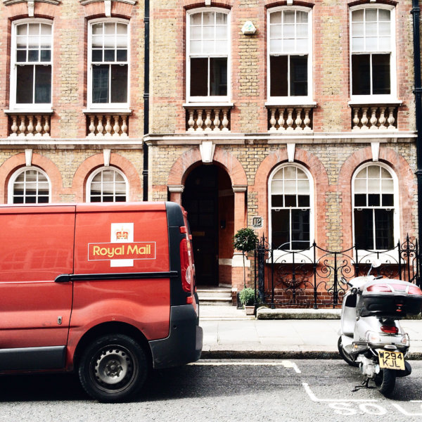
In January 2001, Royal Mail introduced an entirely new name and branding. They changed the name to Consignia. In theory, due to literal definition, this theory made perfect sense. However, it went down horrible. Nobody liked the name at all. The general consensus was that the name was too long, fussy and didn’t roll off the tongue. As well as that, the fact that most people didn’t understand it didn’t help. This also led to the public believing the company were wrong for straying away from the British heritage. Due to this reception and the fact that many articles criticised the new name, the brand changed back to Royal Mail.
This shocking rebranding cost Royal Mail £1.5 million to launch. Not only that, but that also had to fork out an additional million in order to rebrand back to Royal Mail.
As we can see, the idea of rebranding can seem exciting and idyllic, but sometimes you should make sure to not try and fix something that isn’t broken. These companies would have saved massive sums of money, and the trust of their audiences, if they’d have stuck to their roots.


