7 Surprising Colour Combinations that Can Add up to £11,500 to the Value of Your Home

From Barbiecore to 70s revival and dopamine decor, the interior design trends in 2023 have been bold and vibrant, to say the least.
While some homeowners may be reluctant to incorporate such colourful trends into their homes, a property expert has revealed that vivid and striking design themes could increase the value of a home by as much as £11,500.
To help those looking to embrace a more vibrant colour scheme within their home, the experts at paint brand Tikkurila have created a guide identifying the clashing colour combinations that can elevate your property to the next level. Their research also provides key advice on how to successfully incorporate these eye-catching combinations into your next home makeover.
Off the back of this, Jamie Hancox, managing director & paint expert at Tikkurila has shared the 7 surprising colour themes all homeowners should be considering for their next interior design project.
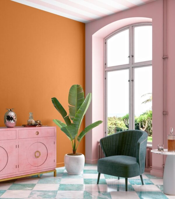
1. Orange and pink
These two playful colours sit so closely on the colour wheel that they aren’t typically thought of as an obvious match. Yet when combined, they exude vibrancy and energy.
Work a vivid and earthy hot orange as the focal point in your design and complement it with varying shades of deep pink to infuse the space with a dynamic and colourful ambience. Or go for a full-blown colour crush, pairing the vibrancy of magenta with the zesty charm of clementine.
To maintain some balance, you can introduce cooler tones like a delicate baby pink into the scheme.
2. Blue and green
‘Blue and green should never be seen’, as the age old saying goes but this couldn’t be further from the truth. As with pink and orange, green and blue are close companions on the colour wheel. Their closeness creates a sense of unity, tying the room together.
Of these tones, the clash of emerald green and teal blue is one of the most luxurious. The key to successfully combining these jewel tones lies in layering multiple shades to create a cohesive and refined look, delivering a rich and intense visual impact.

3. Clashing metals
Traditionally, the notion of blending silvers, golds and coppers in design was considered a no-go. However, in contemporary interior design, this rule is now a thing of the past.
When combining warm and cool-coloured metals, opt for one dominant colour and one accent colour. Warm metals include gold, brass and copper, while cool metals include aluminium, stainless steel and other silver variations.
Jamie Hancox, managing director & paint expert at Tikkurila adds:
“Cast iron and black metals fall into the neutral metals category and beautifully complement both warm and cool tones to add balance, offering an easy way in for those starting out with this trend.”
4. Lime and purple
Zesty lime hues are swiftly gaining popularity, particularly in the premium and youth fashion sectors, renowned for their gender-inclusive and dopamine-bright appeal.
But how can this bold pair find harmony within interior spaces? The answer lies in introducing another player: purple. Specifically, a soft, floral lilac-blue tone. These shades infuse a breath of fresh air, counterbalancing the liveliness of lime with a touch of sophistication.
5. Yellow and white

Traditionally yellow would be used sparingly as an accent colour, because of its vibrancy it can be quite full on.
It’s safer to predominantly use pops of white with yellow accents. That said, if you are looking to go bold and make a statement even on a rainy day – then matching a colour as loud as yellow with white – which you may think doesn’t clash with anything, will actually create a striking contrast.
6. Burgundy and blue

These two colours are adjacent in the light spectrum and the combination of the two creates a visually stimulating space. The deep, rich tones of burgundy evoke a sense of warmth and luxury, while the calming and versatile nature of blue adds balance and depth to any space.
For a more daring approach, consider using burgundy as a primary colour and accentuate it with touches of lighter blues, such as teal or turquoise.
7. Coral and aqua
Coral and aqua make for a vibrant and refreshing colour combination in your home decor that is remnant of the sea.
This combination works particularly well in spaces that receive plenty of natural light, as it enhances the overall sense of freshness and vitality. The contrast between the two colours can create a soothing environment perfect for a bedroom, helping you unwind after a long day and inspiring a peaceful night’s sleep.
Explaining how certain colour combinations can increase the value of a home, Tabitha Cumming property expert at The Lease Extension Company, said:
“Having a nicely decorated home can help a buyer to picture what it would look like when they live in it themselves and potentially increase the amount that they may be willing to pay.
“Interior design choices can increase or decrease the value of a property, with some paint colours boosting the value by around 4% as some colours are favoured more than others.”
With the latest data from the UK House Price Index (HPI) revealing the average house price in the UK is £289,824, homeowners can increase the value of their property by up to £11,593 should they effectively incorporate some of these colour combinations into their home.


